Using Gatsby and Puppeteer to create dynamic Open Graph images
Mar 03, 2022

On this page
- The TL;DR version:
- Before
- After
- Now for the extended version...
- What is an Open Graph image?
- Some examples
- Concept: Open Graph images as a digital billboard
- Our blog
- Just days before, GitHub made Open Graph images 10x better!
- Making Open Graph images 100x better
- Our approach
- Designing the concepts
- Evolving the concept
- Static Open Graph images
- Dynamic Open Graph images
- Before/after: Sharing a /docs URL
- Other Open Graph templates throughout PostHog.com
- How it works
- Overview
- Details
- Testing Open Graph previews
- In summary...
The TL;DR version:
The image preview you see when sharing a link on social media is called the Open Graph image, and is essentially free advertising space. It's a chance to get a message in front of people without them even clicking through to your website.
But most sites (including ours, up until recently) just opt to display a logo and some branding, leaving a lot of opportunity on the table.
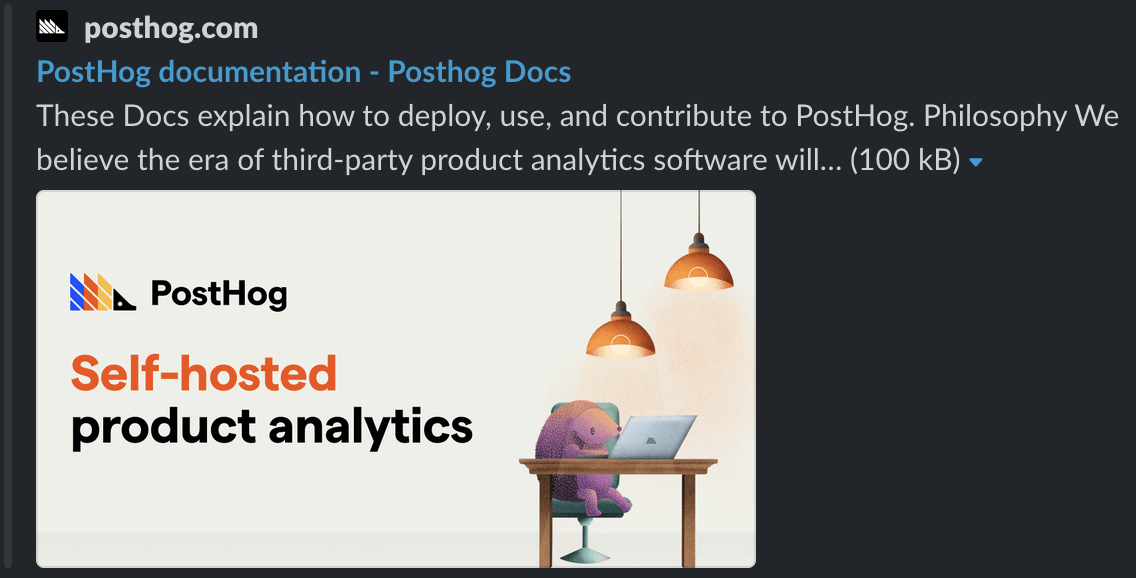
Before
This is what ours used to look like. There’s a lot of untapped potential here.
After
We decided to make better use of the space that Open Graph provides by creating custom layouts and images for most individual pages of our website. Some dynamically generated every time we update posthog.com (like this Docs article).
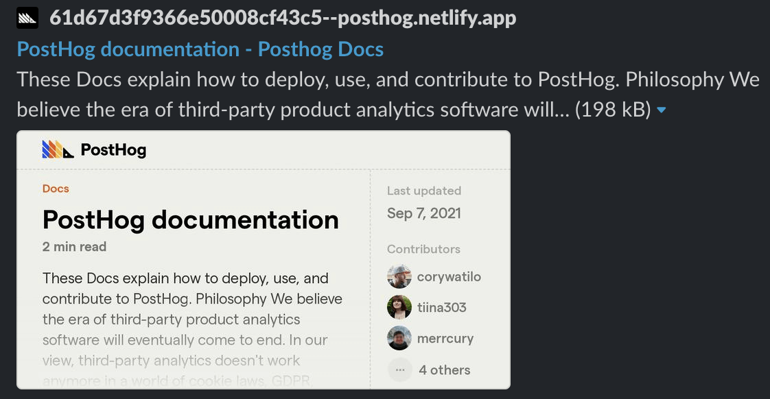
This project is now generating hundreds of Open Graph image previews daily and appearing in Twitter and LinkedIn timelines, and in Slack channels everywhere.
Now for the extended version...
Now that I've drawn you in with the short version, I'll explain in more detail about Open Graph, why we decided to put effort into ours, some inspiration behind it, and how we built our end result in a static website environment.
What is an Open Graph image?
When you share a link on social sites like Twitter, LinkedIn, and Facebook, a special image called the Open Graph image will often appear with the URL. Other apps like Slack, iMessage, and Telegram also use it too.
It’s a great way for websites to make links more visually enticing and websites will often use the same type of imagery as they use in their company’s header image on Twitter, LinkedIn, or Facebook.
Some examples
Stripe uses a gradient background that is synonymous with anyone who’s ever seen Stripe’s website (it’s on brand).

Squarespace uses the space to feature some lifestyle imagery, and an example of the product they offer.

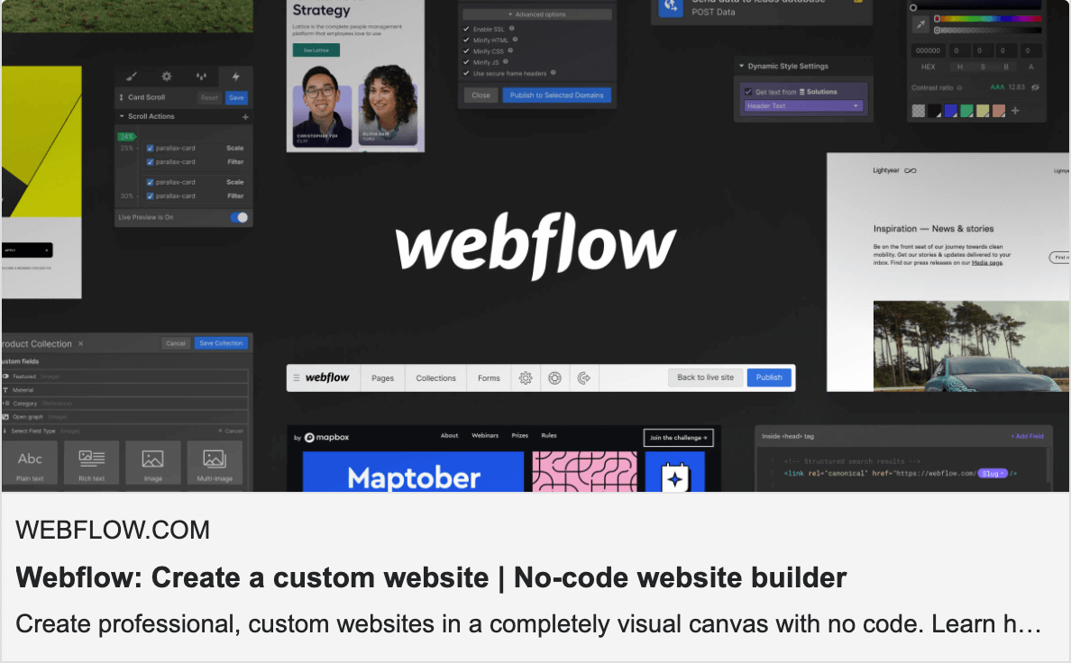
Webflow displays some cool interface elements and product examples within their image.
There are also a lot of major brands who have seemingly put zero effort into link previews.
Apple

Shopify

Microsoft

There’s a lot of missed opportunity - our customers are essentially giving us free ad space in front of their friends, followers, and colleagues. Whatever their connections see here needs to encourage them to want to see more.
Concept: Open Graph images as a digital billboard
Our blog
We frequently post content on our blog, and we frequently create custom artwork for posts we're planning on promoting.
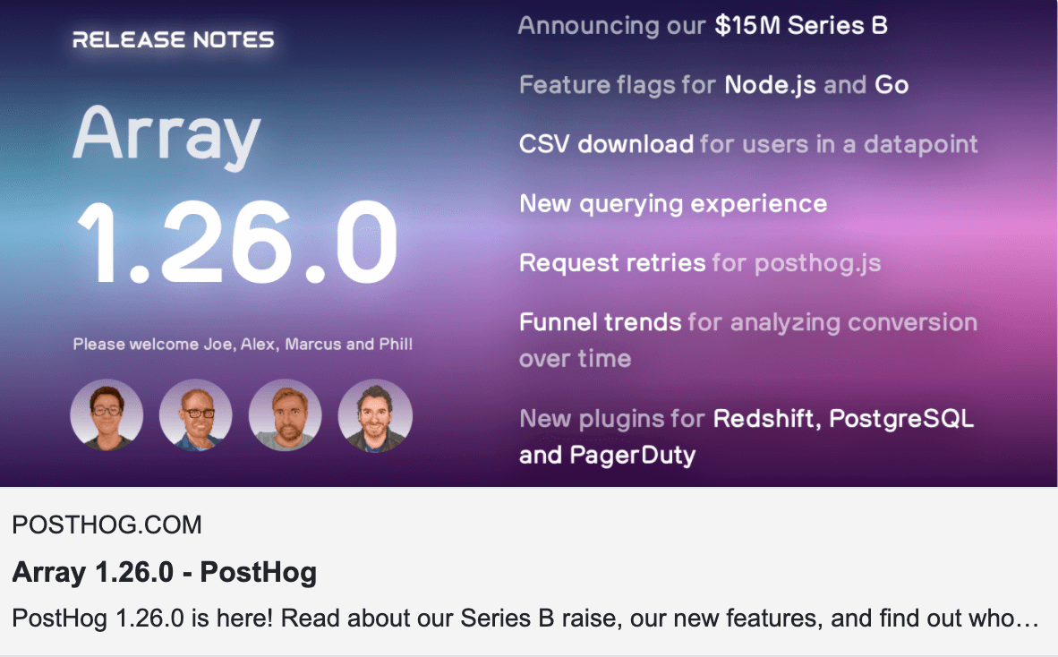
Last year for a product update, we used artwork manually created in Figma that contained a summary of what was in the update. This was our first step in starting to think of better ways to use this space.
Just days before, GitHub made Open Graph images 10x better!
GitHub had just improved link previews when sharing various links across their site.
Now when sharing links to repositories or pull requests, you can see more context before clicking through.
For example, here’s what sharing a link to a pull request looks like.
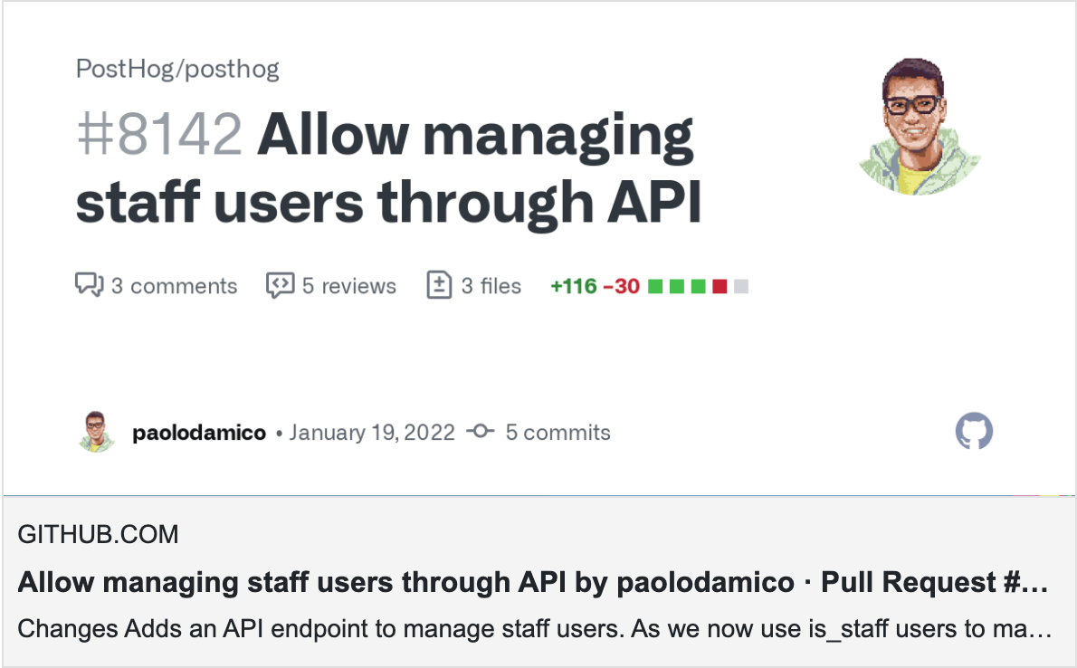
Aside from being more visually interesting than a static image, it also serves to prepare the reader on what they’re about to click. Even this brief context is valuable - and definitely more valuable than a single static site-wide image.
I should point out that GitHub also allows repos to upload a custom Open Graph image, which we use as an opportunity to communicate the highlights of our product.
This served as inspiration for PostHog: How could we take this concept but 10x what GitHub did?

Making Open Graph images 100x better
As PostHog is a developer-first product and we see our website as a leading sales channel, we’re constantly optimizing for our technical audience. We ask ourselves the question, “What would resonate with us?” and then we try to build that.
It’s important for our business that we capture a potential visitor’s attention regardless of their entry point and traffic source. They might discover PostHog on the feed of a social network or from a colleague sharing a link in their company’s Slack.
As a designer, I often think to myself, “If I were standing over someone’s shoulder as they see the PostHog brand for the first time, would I be proud of what they see?”
As a company, we typically agree spending a little extra time on these details is worth it for our brand.
Our approach
We decided to use a hybrid approach, generating some images on-the-fly, and also employing static images for content that doesn’t change too frequently.
Our content is split into two main types:
- Static, marketing content - pages that aren’t frequently updated
Eg: Product pages (
/product,/product/session-recording, etc) - Dynamic, editable content - Docs, Handbook, Blog
- Docs pages (often shared internally when discussing deployment or installation)
- Blog posts - all of which have artwork, many of them custom
- Careers - obviously highly dynamic
Designing the concepts
In our website’s Figma project, I used a template by Ryan Warner that let me design on a single artboard (as a component) while simultaneously previewing the result for Twitter, Discord, Slack, and Facebook.
(It's useful to verify image sizing, since sometimes images are scaled down. Also, don’t forget how small text is going to appear on mobile!)
Evolving the concept
We posed some questions about what would make these Open Graph images useful:
- What if the image preview was a screenshot of the webpage? Is this type of thumbnail captivating?
- What if you could read part of an article (Docs, Handbook, Blog) in the image preview (like when reading a news article before hitting the paywall)? Would this draw you in and make you want to read more?
Static Open Graph images
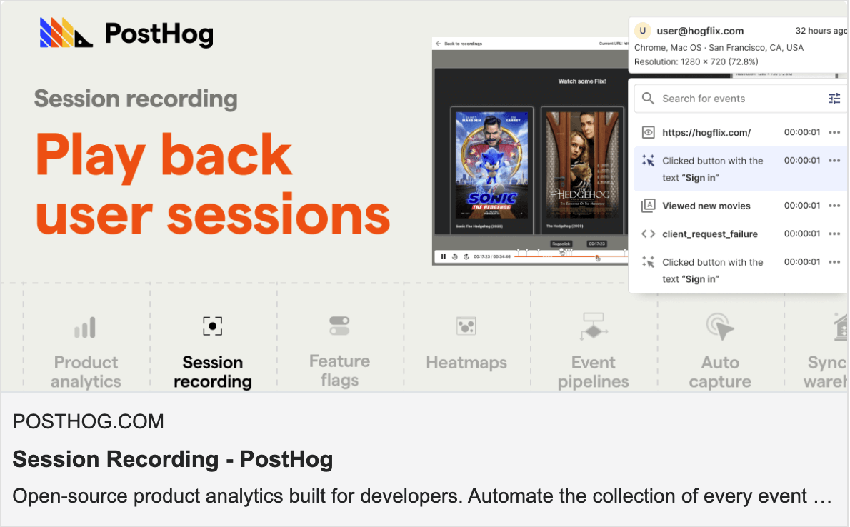
In this PR, we created static Open Graph images for each of our main product pages. These images don’t need to be frequently updated, so it was okay to put a little more time in crafting one-off pieces for each.
Here’s what you’ll see when sharing posthog.com/product/session-recording:
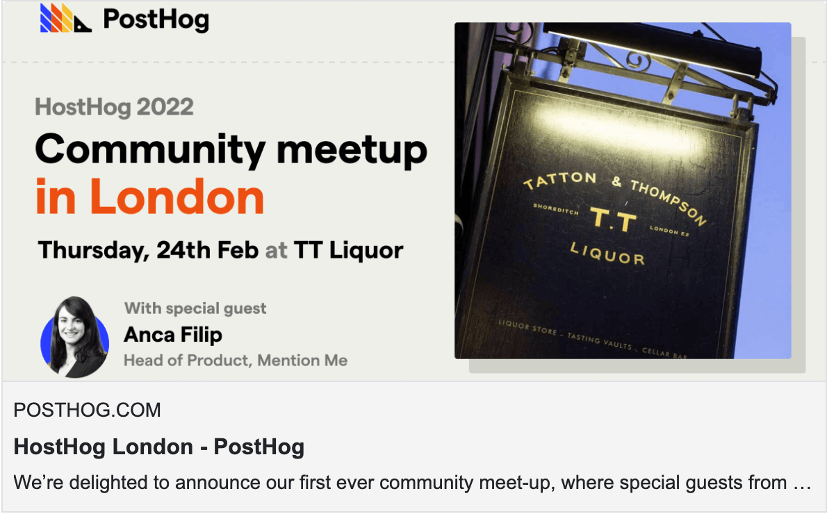
We also build custom artwork for pages we know are likely to be shared, like for an event we’ll be hosting soon.
Dynamic Open Graph images
Now for the fun part...
Similar to GitHub’s approach, we automatically generate some Open Graph images so our Graphic Designer, Lottie, doesn’t have to be on call 24x7 for whenever we publish a blog post.
Before/after: Sharing a /docs URL
Before (previous site-wide Open Graph image)
We shared a single static image across all Docs articles

After
Now we show a preview from the article, along with some relevant information about it that you might like to know.

This gives us the chance to draw a user into the content on the page before they decide to click. Our bet was this could increase clickthroughs by reducing the uncertainty about what was on the other side of the link.
Questions visitors may subconsciously have could include:
- How fresh is this content?
- How much of a time investment is this going to be?
- Is this a website that's going to bombard me with ads?
- Will I be able to easily access the information I might click to see?
- Does this website "seem" like it will load quickly?
Believe it or not, we can address all of these questions using visual cues in these images, and we can communicate them in a fraction of a second.
Other Open Graph templates throughout PostHog.com
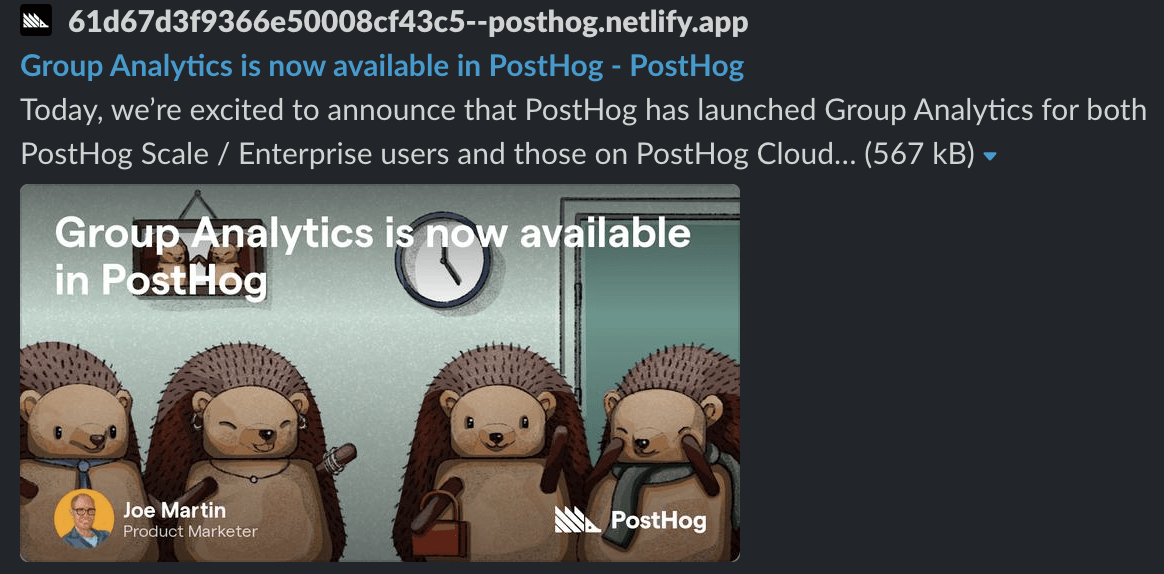
Blog post
There are a considerations for our blog posts:
- If we place an image in the background, text layered on top needs to be readable. The fix? We added subtle text shadows and partially transparent gradients layered between the text and image.
- Some posts have multiple authors, so that needs to be factored in.
- In some cases, post images have text inside the image that would be obscured with auto-generated Open Graph images. We have a parameter in our blog post’s front matter to skip this image generation.
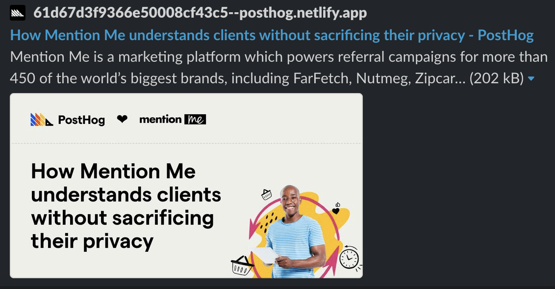
Customer stories
Since each customer story involves two logos, we placed them at the top along with a heart in between.
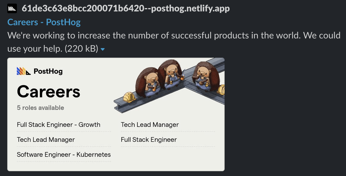
Careers
Especially useful for the PostHog team when posting roles on LinkedIn, this image is always up to date with the latest roles we’re hiring.
How it works
Overview
We use Gatsby, a static site generator, so once the build process is complete, we run through a series of steps:
- Pass an HTML string containing some page data to Puppeteer (a Node library for headless screenshotting) for each page
- Load images and our custom font and screenshot the preview
- Use the new image instead of our site-wide fallback Open Graph image
Details
Gatsby has a really cool API that allows you to hook into the last point of the build process: onPostBuild. This is where all of the magic takes place.
We first query for each page that will use custom Open Graph images. (Right now, that's Docs, Handbook, Customers, Careers, and our blog posts.)
From there, we do some initial setup:
- Create folders for images and fonts
- Download our webfont
- Spin up a new Chromium page with Puppeteer
After setup is complete, we finally iterate through each queried page, set the content of the Chromium page with an HTML string, screenshot the page, and save it. Here's what that looks like for blog posts:
What's happening in this for...of loop, though?
Since the site isn't technically "live" yet, we don't have access to a public URL to insert into our HTML template. The workaround is embedding it in an <img /> element as Base64. You'll see this workaround in a few other places in the code.
We have an asynchronous function called createOG. This handles setting the Chromium page content, screenshotting, and saving the image. It takes an HTML string to set the Chromium page content and a slug to create the file name of the screenshot.
You can explore our solution in this pull request.
Testing Open Graph previews
There are a handful of tools to test Open Graph previews, but my personal favorite has become metatags.io, as it’s fast, simple, and not cluttered with ads. (It will even generate your Open Graph meta tags for you!)
It's important to note that some websites cache Open Graph on their servers. If you think you uploaded a new version of an Open Graph image to your website but your changes aren't appearing, this might be why! Facebook has a useful Graph debugging/cache busting tool.
In summary...
This was a really fun project to work on, as it adds immediate value on a daily basis to anyone seeing a link to PostHog.com. On a personal note, it’s pretty special to work at a company where this type of polish is valued.
We still consider this a v1 approach, as there are plenty of edge cases to work through - not to mention what to do with article's begin with images or titles - like how to format it all.
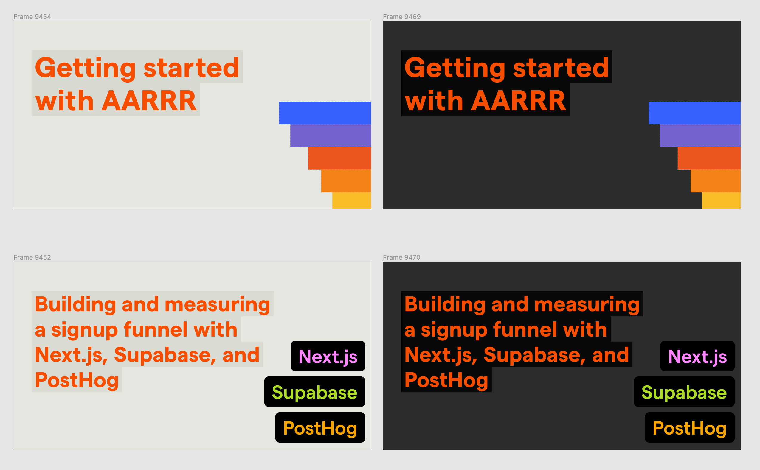
In a future update, we plan to make our Tutorials Open Graph images transparent so they naturally work in both light and dark modes.
We've also designed (and plan to implement) dynamic images for personalized landing pages (to be shared with prospective customers) so PostHog feels a little more personalized when our link is shared around a company’s Slack.
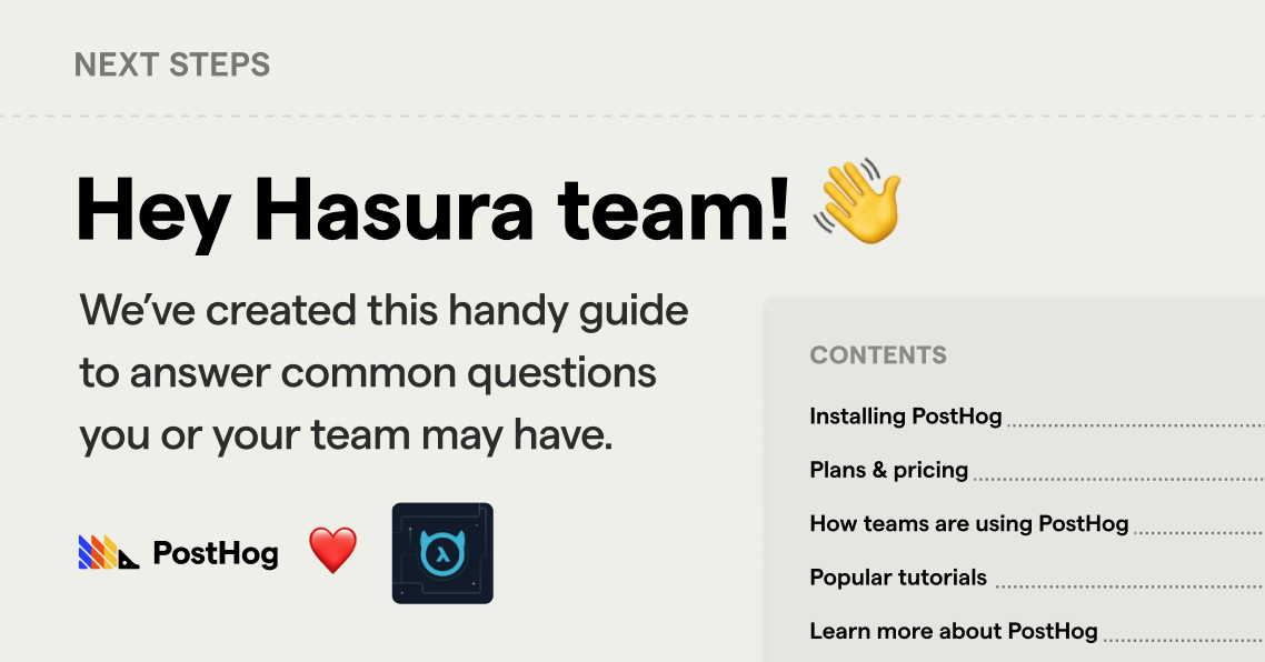
But this first step is light years more interesting to look at than a simple PostHog logo on a white background. (If you see opportunity for improvement, we invite you to submit a pull request on our website’s repo!)
A tip of the hat goes to the team at GitHub who worked on their new Open Graph images, as it served as a starting point in inspiring what we ultimately built.
We really hope you enjoy seeing our Open Graph previews across the internet as much as we enjoyed making them!

Subscribe to our newsletter
Product for Engineers
Helping engineers and founders flex their product muscles
We'll share your email with Substack
